Sep 5, 2019
4 Ways to Make Your Packaging Stand Out
To help the products in your private label skin care line stand out from the competition, whether on the shelf or online, you need to design eye-catching packaging that will not only attract attention, but also indicate to your customers what kind of relationship they can expect to have with your brand. Attractive packaging has been scientifically proven to increase the likelihood of impulse purchasing, and the most successful brands have relied on consistent design elements over the course of many years. To make the most of this key marketing element, consider the four design options outlined below.
Before you begin, know your brand and your market.
All design elements play a role in communicating a message, and you will want to know what that message is right at the beginning. The first step is knowing what kind of customer you are trying to reach and what will appeal to them: Are they motivated by value, clinical research, luxury, trends? Next you will want to know how you will distinguish your brand from the others trying to reach the same people: are you more high-end, more edgy, more environmentally-conscious? All of these considerations will affect your choices.
1. The expressive impact of color:
Most people have an instinctive emotional reaction to color, making it one of your most effective marketing tools. Pale, light colors will usually look clean and soft, while deep jewel tones will convey a sense of opulence. Pungent, punchy or neon shades will give your brand an edgy flavor, and muted earth tones will evoke natural ingredients and eco-friendliness.
Whether you pick one signature color that stands alone, a rotating palette of harmonizing tones, or an artfully jarring contrast of different shades, your color choices will play a large role in setting your brand apart.
2. Explore patterns and illustration:
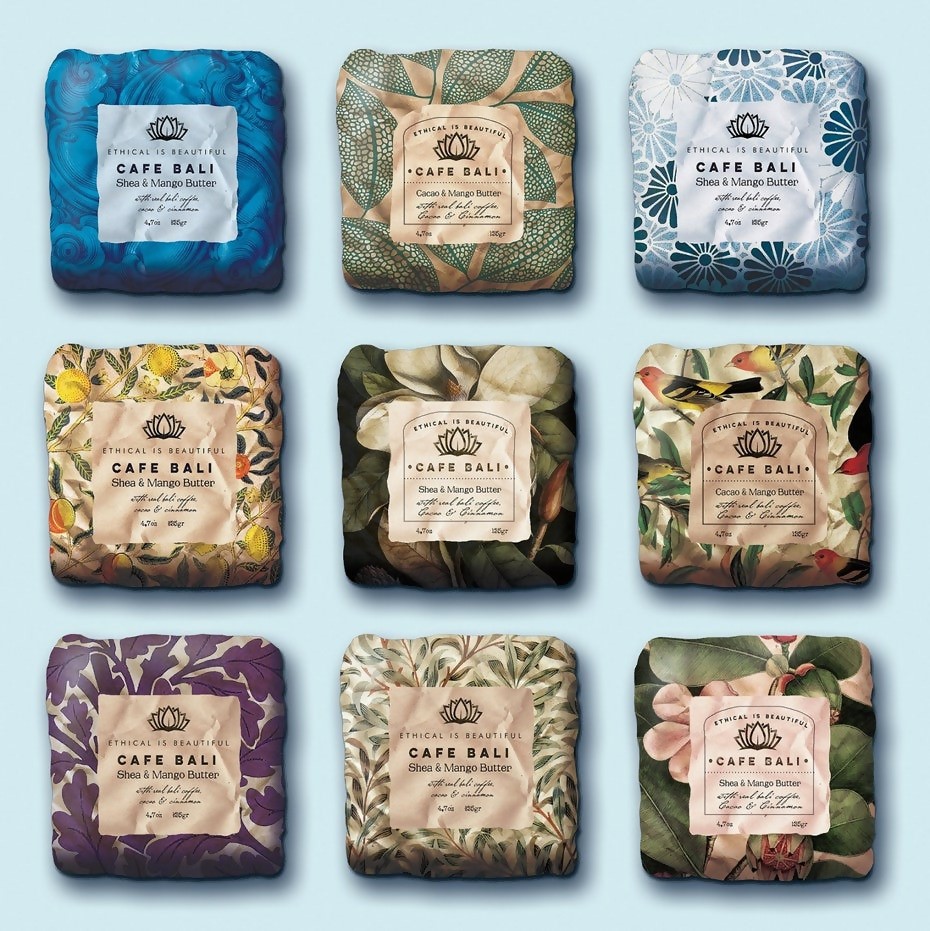
Café Bali
Delicate line illustrations, vintage “hipster” clip art, botanical patterns or jazzy zig-zags: the abundance of patterns and images is infinite. You can even make distinctions within a single category to match your brand message more precisely. To use florals as an example, some patterns are opulent and lush, some delicate and sweet, and some simplified and spa-like.
One factor to consider is the size of your packaging relative to the size of the pattern or illustration. If your packaging is too small, the graphics will not have enough space to make an impact.
3. Working with the surface texture:
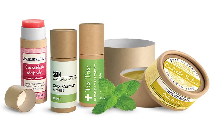
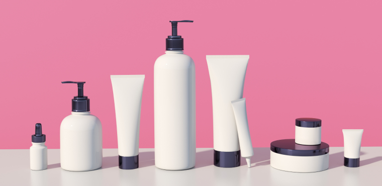
SKS Product Spotlight
The varieties of surface textures can span the spectrum from flashy to hand-made. You might use reflective surfaces, metallics, holograms, or embossing to create a package that seems fun or expensive. Alternatively, you might use natural fibers, rough textures or raw-looking materials to emphasize sustainability or a craft aesthetic.
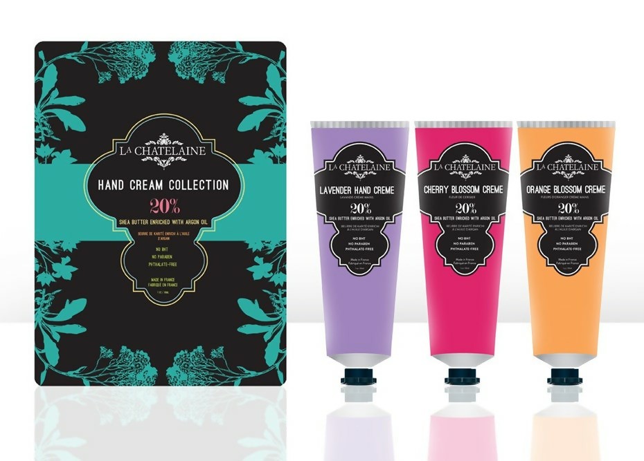
4. The power of simplicity:
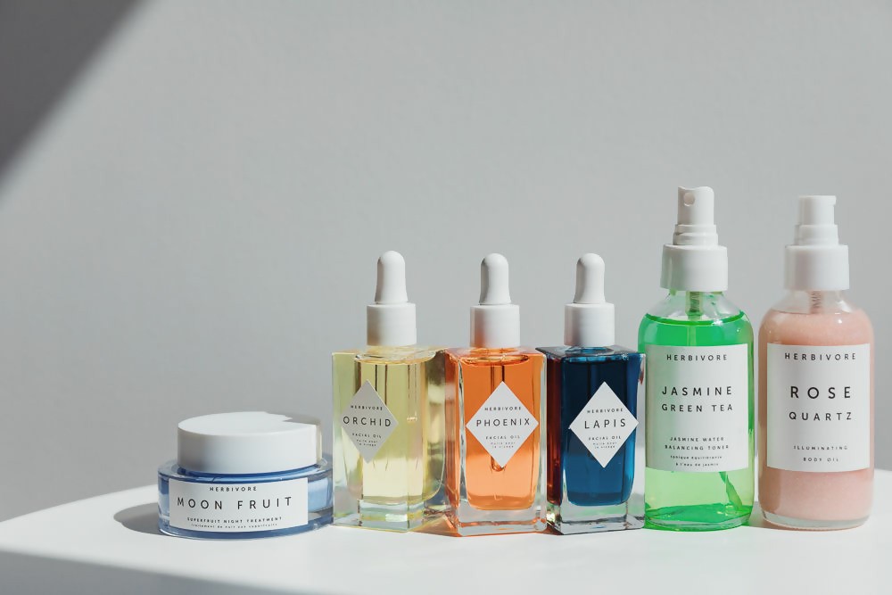
Herbivore
Empty space and minimalist choices can help your packaging look sleek, sophisticated or pure. With these simple designs, your choice of font and layout becomes even more important.
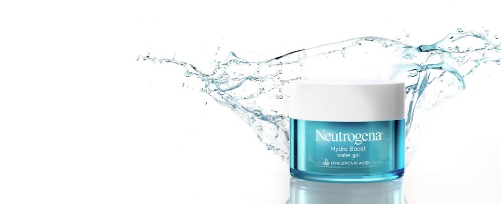
Case study: Neutrogena
Neutrogena
With its Hydro Boost line, Neutrogena combined the familiar look of its packaging with new elements to make this new product offering stand out on the shelves while still being a recognizable part of the brand. The traditional Neutrogena design promotes a sense of purity and clinical efficacy with its very simple container shape and use of blank space. The primary brand identifier is the font used for its name, which is consistent across all products.
In order to promote the moisturizing ability of Hydro Boost, the containers in the line are transparent to allow the distinctive sky-blue color of the product to show through. The associations, particularly with the clear formulas, are cleanliness and fresh water. The Hydro Boost packaging differs from Neutrogena’s Rapid Wrinkle Repair containers only in color (blue product through clear packaging vs. silver opaque containers), which makes both recognizably part of the same brand yet distinct from each other.
Tips for going forward:
Once you have some ideas for your packaging, use these tips to help you get it into production:
- Use a professional designer who has experience with packaging. Your manufacturer may have someone on staff, or they may be able to recommend a freelancer.
- Consider function as well as form. Different containers and dispensers work best for different products, and some containers should be designed to be waterproof or nonslip.
- Before you commit to a design, run samples by a focus group or some of your best customers and get their feedback. If you need to make any changes, catching them early will save you time and money.